Jul 27, 2023

Good designs solve problems and make people happy. But great designs do so at a scale. As designers, If we make products that don’t scale well, we are doing a lazy job. We have to anticipate variations and plan for them, otherwise, our designs can break.
Why Scale Is Important
Real products are used in various ways other than the ideal use case. To ensure that your design doesn’t break under these changing conditions, you must design for scale from the beginning.
A car seat, for instance, must be suitable for different body types. Otherwise, we would need to make different seats for all possible customer body types. Or when building a bridge, we must ensure it can handle diverse weather conditions like strong winds and extreme temperatures. It also needs to handle traffic and the weight of a few or many vehicles.
Digital design is no different. To do great work as designers we need to ensure that we consider all scale-related variables. We need to make sure that our products will work just as well if our products grow in scale overnight. If you were designing a marketplace, what would happen if the entries increased ten-fold in 24 hours? Would the content still scale well? Scale matters and your products need to cover all possible scenarios.
To make your design scalable, you need to consider a number of areas. Here are four of the key considerations that we must make as designers.
Scaling Patterns
Design patterns are one of the usual points of failure. If you have an explosion of scale, with many more posts, users, search results, table entries, etc., your design patterns could fail. For example, if you design a page with up to 10 entries, but some users will have hundreds, their experience will likely be terrible. The page could require excessive scrolling, it could load slowly, and it might feel visually overwhelming. Or what if you designed a simple card that has tags, a description, and an author? Did you consider what would happen if the description is longer than the allocated space? What if there are multiple authors? Or dozens of tags? Make sure to test your patterns at a large scale, or you will have troubles down the line.

To avoid pattern failures, you need to test each individual pattern and overall page, at different scales. Start with your typical case, then expand to a large scale, and back down to little or no scale. Once you consider both of these extremes, your design will be much better equipped to handle scale at the pattern level.

Questions to consider for designing scalable patterns:
What if our user base grows 10x, will this still work?
If we have twice as many listings, would discovery still be easy?
What if the content is longer than a page length?
Should my text get truncated?
Will performance get impacted if we get a spike in traffic?
Did I consider the empty state?
What if there are no recommendations?
Scaling Load Time
Another common scale problem is page load. Say you designed something that worked well for up to 20K monthly active users. So far so good. But then the user base grew to 100k. At this scale, the page started loading very slowly and thus hurting the user experience. Even though that is technically a code problem, sometimes it is not optimal to fix it in code. Your designs can be optimized for speed improvements as well.

Some of this can’t be done without working with your engineering team. From a design perspective, pages that cause loading problems typically try to include too many images or require scanning too much data. The best practice here is to keep things simple. Only add functionality and elements that are really needed. It can also be a good idea to talk to your engineers to make sure that what you are building will scale well. They can perform certain load tests that could show potential issues.
Questions to consider for designing a lightweight page:
Are all the images needed?
Is all the displayed user data necessary?
Do we need to load all entries, or can we only display a few key items and lazy load the rest?
Can we use pagination to optimize this table?
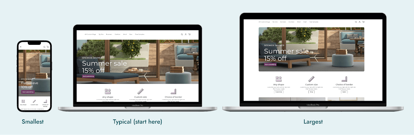
Scaling Screens
Next up, screen size. Nowadays, we need to design for all kinds of screen sizes, some of which are small, while others are quite large. Smartphones have varying sizes, and there’s also tablets, desktops, TVs, and car screens. This is without getting into the emerging world of mixed reality. Failure to consider this dimension of scale can cause you a lot of trouble. So do yourself a favor and design responsively.
Responsive design is a larger topic and you can find a lot of materials about it online. But in short, it’s about trying your design at different screen scales. Start by identifying all the screens and devices that you need to support.
Design the most typical target screen size first. Then, add the smallest and largest extremes that your design will target. Depending on how your development team works, this might be enough, or you might need to consider a couple of other in-between states as well.
Scaling Locations
As your product scales across different locations and cultures, you will start experiencing scalability issues. That is, of course, if you didn’t already design for internationalization and localization. They can ensure that you have designed a product that works at a global scale. Though these two concepts are related, they do have notable differences.
Internationalization refers to the process of making your product work across different languages, currencies, and rules. For example, if your product needs to work well in Europe, you need to make sure that it can handle different languages, German being the most notoriously long compared to English. You also need to ensure that proper date formats are used, as well as handle the euro € currency. Note that certain data collection laws, such as Europe’s GDPR, also fall under this umbrella of internationalization.
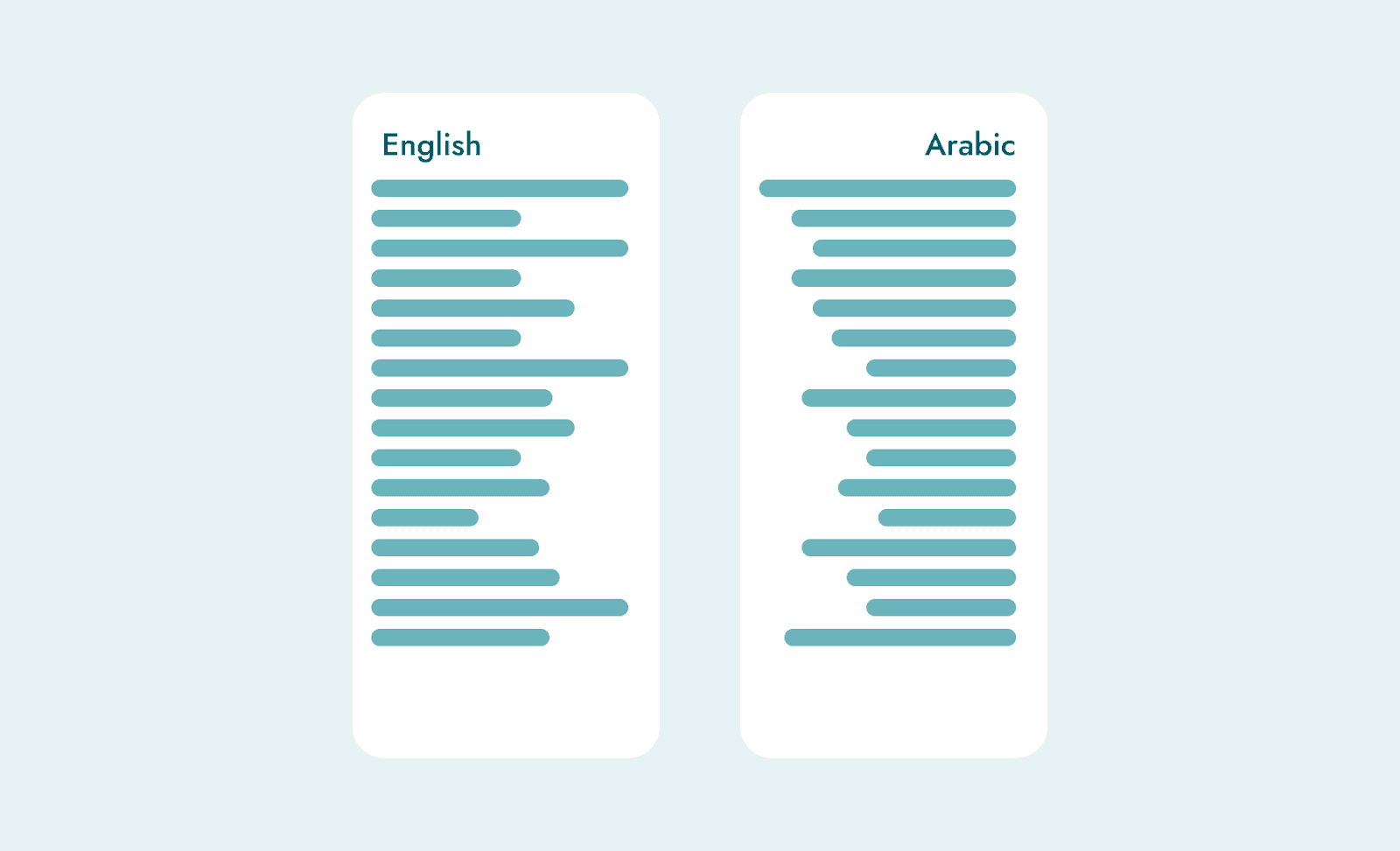
Localization takes things further by making your product fit within different cultures more deeply. This could mean localizing content, colors, and choice of phrasing. In some cases, such as Arabic or Japanese, which read in directions that are different from that of English, you will need to rearrange your entire layout. Making something truly feel local requires getting a deeper understanding of all the cultures that your product will live in.
Conclusion
To create designs for sustainable success and widespread adoption, it’s important to consider how your patterns, load time, screens, and locations might scale. When we account for scale in our designs, we can build products that withstand the test of time, delight users across different contexts, and make a meaningful impact on a global scale.